View a live demo of this section here.
The following is a detailed listing of the styling edits made to the section, the modules used in the section, and field changes from the modules' default state.
Section Styles
No styles have been applied.
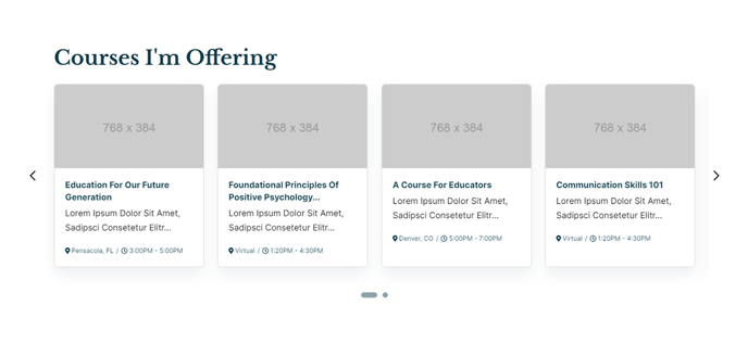
Modules
| Visible Elements | Heading |
| Styles > Module > Spacing > Desktop > padding | Bottom: theme.global.spacing.rows |
| Card Style | Slider |
| Layout > Carousel Type | Slide |
| Layout > Carousel Rewind | true |
| Layout > Text Tags Position | Bottom |
| Layout > Desktop | Per Page: 4 Per Move: 4 Spacing: 25 |
| Layout > Tablet | Per Page: 3 Per Move: 3 Spacing: 20 |
| Layout > Mobile | Per Page: 1 Per Move: 1 Spacing: 0 |
| Styles > Card > Box Shadow | Animate: Animate Out |
| Styles > Text Tags > Font | Size: theme.typography.body_text_tiny.font.size |