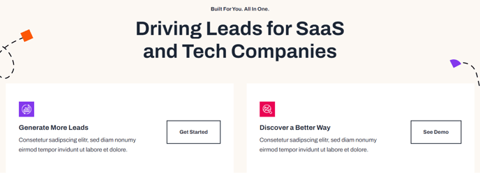
Call to Action Cards [+ only]
A set of cards with icon, text, and call to action.
Note: This module is only available in Framework+, a paid version of Framework.
View a live demo of this module.
Content
- Include a heading
- Add any number of cards with icon, title, text, and call to action
- Make entire card clickable to call to action link
- Set number of cards to include in a row
Styles
- Set dark mode on heading and cards separately
- Change text alignment and max width of heading
- Change heading level of heading in the cards
- Set a load in and hover animation on cards
- Change background color, border, and box shadow of cards
- Change text alignment of cards
- Change call to action position of cards (left, right, bottom left, bottom center, bottom right)
