Click here to view a live example of the module.
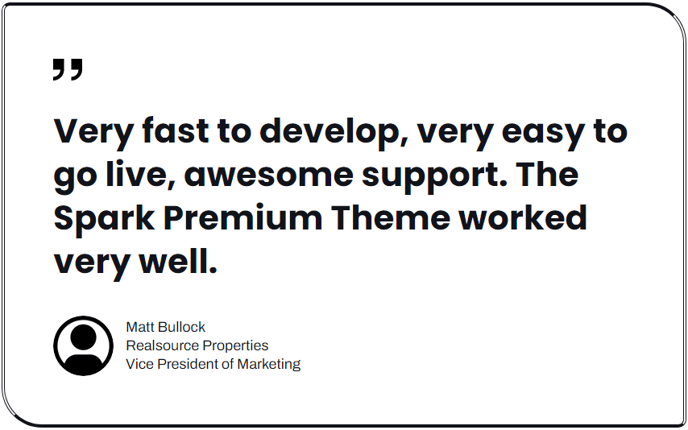
Content
- Quote [Text] : Text for the displayed quote.
- Quoter's Name [Text] : Text for the displayed meta name of the entity the quote is from (doesn't necessarily have to be a name; this is only a recommendation).
- Quoter's Company [Text] :Text for the displayed meta company name of the entity the quote is from (doesn't necessarily have to be a company; this is only a recommendation).
- Quoter's Title [Text] : Text for the displayed meta job title of the entity the quote is from (doesn't necessarily have to be a job title; this is only a recommendation)
- Quoter's Image [Image] : A profile image, logo, or other image to display with the meta text. Can add alt text, edit the width and height, and choose the loading functionality of the image (browser default, lazy, or eager).
Styles
Decoration [ Group]
Fields to edit the decorative quotation above the quote.
- Remove Decoration [Boolean] : Check to remove the decoration entirely.
- Color [Color] : Change the color of the default decoration (cannot be applied to a custom decoration).
- Custom Decoration [Image] : Add your own image to use for decoration. Can edit the alt text, width, and height of the image.
Quote [Group]
Fields to edit the displayed quote text.
- Text Alignment [Alignment] : Change the alignment of the text to Left, Center, Right, or Justify.
- Semantic Heading Level [Number] : Change what HTML heading element is used for the text (h1-h6); headings on a page should form a hierarchy without skipping levels. For example, an h3 should not appear without an h2 preceding it.
- Font [Font] : Change the font family, size, color, and style of the text.
- Line Height [Number] : Change the line height of the text.
- Letter Spacing [Number] : Change the letter spacing of the text.
- Mobile Font Size [Number] : Change the font size of the text on mobile.
- Mobile Line Height [Number] : Change the line height of the text on mobile.
- Text Transform [Choice] : Choose to transform the text to Capitalize, Uppercase, or Lowercase.
Meta [Group]
Fields to edit the displayed meta text.
- Horizontal [Alignment] : Change how the meta block is horizontally aligned within the module to Left, Center, or Right.
- Text Alignment [Alignment] : Change the alignment of the text to Left, Center, Right, or Justify.
- Font [Font] : Change the font family, size, color, and style of the text.
- Line Height [Number] : Change the line height of the text.
- Letter Spacing [Number] : Change the letter spacing of the text.
- Mobile Font Size [Number] : Change the font size of the text on mobile.
- Mobile Line Height [Number] : Change the line height of the text on mobile.
- Text Transform [Choice] : Choose to transform the text to Capitalize, Uppercase, or Lowercase.
- Quoter's Name [Group] : Fields for changing font settings of the name meta.
- Font [Font] : Change the font color and style of the text.
- Text Transform [Choice] : Choose to transform the text to Capitalize, Uppercase, or Lowercase.
- Quoter's Company [Group] : Fields for changing font settings of the company meta.
- Font [Font] : Change the font color and style of the text.
- Text Transform [Choice] : Choose to transform the text to Capitalize, Uppercase, or Lowercase.
- Quoter's Title [Group] : Fields for changing font settings of the title meta.
- Font [Font] : Change the font color and style of the text.
- Text Transform [Choice] : Choose to transform the text to Capitalize, Uppercase, or Lowercase.
- Image Placement [Choice] : Choose the placement of the image in relation to the meta text. Choices include Top, Right, Bottom, or Left.
Border [Group]
Fields for changing the border around the entire contents of the module.
- Top [Group] : Fields for changing the top side border.
- Style [Choice] : Choose the style of the border. Choices include None, Solid, Dotted, Dashed, or Double. Choosing None will remove the border.
- Width [Number] : Change the width of the border, in pixels.
- Color [Color] : Change the color of the border.
- Right [Group] : Fields for changing the right-side border.
- Style [Choice] : Choose the style of the border. Choices include None, Solid, Dotted, Dashed, or Double. Choosing None will remove the border.
- Width [Number] : Change the width of the border, in pixels.
- Color [Color] : Change the color of the border.
- Bottom [Group] : Fields for changing the bottom side border.
- Style [Choice] : Choose the style of the border. Choices include None, Solid, Dotted, Dashed, or Double. Choosing None will remove the border.
- Width [Number] : Change the width of the border, in pixels.
- Color [Color] : Change the color of the border.
- Left [Group] : Fields for changing the left side border.
- Style [Choice] : Choose the style of the border. Choices include None, Solid, Dotted, Dashed, or Double. Choosing None will remove the border.
- Width [Number] : Change the width of the border, in pixels.
- Color [Color] : Change the color of the border.
Corners
Fields for changing the radius of the border around the entire contents of the module.
- Global Radius [Number] : Set the radius of all corners to the same number of pixels.
- Custom Radius [Boolean] : Choose to set a different radius for each corner.
- Top Left [Number] : Visible only if Custom Radius is checked. Set the radius, in pixels, of the top left corner of images.
- Top Right [Number] : Visible only if Custom Radius is checked. Set the radius, in pixels, of the top right corner of images.
- Bottom Left [Number] : Visible only if Custom Radius is checked. Set the radius, in pixels, of the bottom left corner of images.
- Bottom Right [Number] : Visible only if Custom Radius is checked. Set the radius, in pixels, of the bottom right corner of images.
Spacing
Fields for changing the white space and alignment of the module.
- Horizontal [Alignment] : Choose how the module horizontally aligns (Left, Center, or Right) within the section/column it is placed in.
- Spacing (Desktop) : Change the padding and top/bottom margin of the module on desktop.
- Spacing (Mobile) : Change the padding and top/bottom margin of the module on mobile.