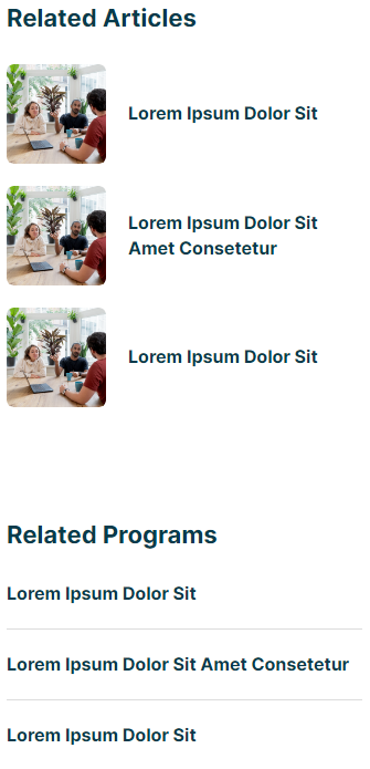
Blog Post - Sidebar
Section displayed to the right of the blog post content for listing out other resources and links.
View a live demo of this partial here.
The following is a detailed listing of the styling edits made to the partial's sections, the modules used in the sections, and field changes from the modules' default state.

Section 1
Section Styles
| Alignment and spacing > Content alignment | Full Width |
| Alignment and spacing > Padding | Top: 0 Bottom: 0 |
Modules
| Visible Elements | Heading |
| Semantic Heading Level | 3 |
| Style Heading Level | 4 |
| Styles > Module > Spacing > Desktop > Padding | Bottom: theme.global.spacing.rows |
| Card Style | List |
| Data Source | Blog |
| Blog Posts > Post Type | Related |
| Blog Posts > Include | Thumbnail |
| Layout > Add Divider | false |
| Layout > Desktop | Thumbnail Position: Left Row Spacing: 20 Image Spacing: 20 |
| Layout > Tablet | Thumbnail Position: Left Row Spacing: 20 Image Spacing: 20 |
| Layout > Mobile | Thumbnail Position: Left Row Spacing: 20 Image Spacing: 20 |
| Styles > Card > Box Shadow | Animate: None |
| Styles > Thumbnail > Aspect Ratio | 1:1 |
| Styles > Thumbnail > Width | 90 |
| Styles > Title > Font | Size: theme.typography.body_text_mediuam.font.size Mobile Size: theme.typography.body_text_mediuam.font.size |
| Visible Elements | Heading |
| Semantic Heading Level | 3 |
| Style Heading Level | 4 |
| Styles > Module > Spacing > Desktop > Padding | Top: theme.global.spacing.sections Bottom: theme.global.spacing.rows |
| Card Style | List |
| Data Source | Blog |
| Blog Posts | Related |
| Layout > Desktop | Row Spacing: 20 |
| Layout > Tablet | Row Spacing: 20 |
| Layout > Mobile | Row Spacing: 20 |
| Styles > Card > Box Shadow | Animate: None |
| Styles > Title > Font | Size: theme.typography.body_text_mediuam.font.size Mobile Size: theme.typography.body_text_mediuam.font.size |