View a live demo of this section here.
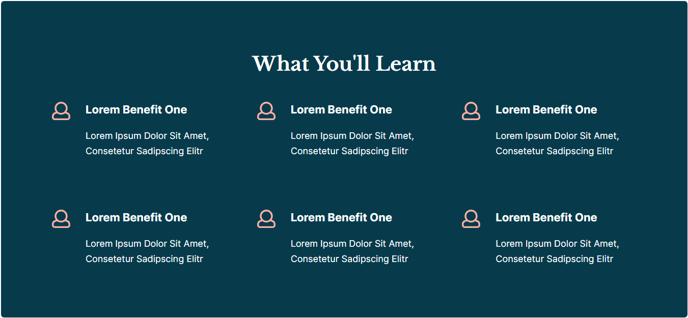
The following is a detailed listing of the styling edits made to the section, the modules used in the section, and field changes from the modules' default state.
Section Styles
| Alignment and spacing > Max Width | theme.global.max_width_wide |
Column Styles
Column 1
| Background Color | theme.global.colors.backgrounds.medium_dark.color |
| Padding > Default | Top: theme.global.spacing.sections Right: theme.global.spacing.sections Bottom: theme.global.spacing.sections Left: theme.global.spacing.sections |
| Padding > Mobile | Top: theme.global.spacing.sections / 2 Right: theme.global.spacing.sections / 2 Bottom: theme.global.spacing.sections / 2 Left: theme.global.spacing.sections / 2 |
Modules
| Styles > Dark Mode | true |
| Styles > Module > Spacing > Desktop > Padding | Bottom: theme.global.spacing.rows * 2 |
| Styles > Alignment > Desktop | Center |
| Layout > Icon Position | Left |
| Layout > Icon Alignment | Flex Start |
| Layout > Icon Spacing | 30 |
| Layout > Desktop | Row Spacing: theme.global.spacing.sections Column Spacing: 60 |
| Layout > Mobile | Row Spacing: theme.global.spacing.sections / 2 |
| Styles > Dark Mode | true |
| Styles > Alignment > Desktop | Left |