Note: The section this module is added to should have its Content Alignment set to Full width.
View a live demo of this module.
Content
Resources [Group]
Dynamically add resources from a blog or HubDB, or manually add resources using a repeater group.
- Blog [Boolean] : Check to add blog posts to the listing.
- Blog Posts [Repeater Group] : If Blog is checked, add any number of blogs.
- Blog [Blog] : Select blog to pull posts from.
- Additional Filter [Choice] : Choose to only show posts that contain a certain Tag or are written by a certain Author.
- Author Slug [Text] : If Additional Filter is set to Author; set the author slug you want to filter the posts by. The author slug is the text seen in the URL of the author page, essentially the author name in all lowercase with spaces replaced with a dash.
ex: author-name. - Tag [Tag Selector] : If Additional Filter is set to Tag; choose the tag to filter by.
- Limit [Number] : Limit the number of posts to pull in (listing can only pull in a maximum of 200 posts).
- HubDB [Boolean] : Check to add rows from a HubDB to the listing.
- Resource HubDB [Repeater Group] : If HubDB is checked, add any number of HubDB tables.
- HubDB Table [HubDB Selector] : Select the HubDB table you want to pull data from.
- Image Column [Text] : The name of an image column in your HubDB that you want to pull in for the thumbnail image.
- Image Alt Column [Text] : The name of a text column in your HubDB that you want to pull in for the thumbnail alternative text.
- URL Column [Text] : The name of a text column in your HubDB that you want to pull in for the URL.
- Title Column [Text] : The name of a text column in your HubDB that you want to pull in for the title.
- Summary Column [Text] : The name of a text column in your HubDB that you want to pull in for the summary.
- Date Column [Text] : The name of a date column in your HubDB that you want to pull in the for that publish date.
- Categories [Repeater Group] : Columns in your HubDB you want to use as filters.
- Category Label [Text] : The backend name for the category. This must match a Filter Name listed in Filters & Search.
- Category Column [Text] : The name of a text, select, or multi-select column in your HubDB that you want to be able to filter by.
- Resource HubDB [Repeater Group] : If HubDB is checked, add any number of HubDB tables.
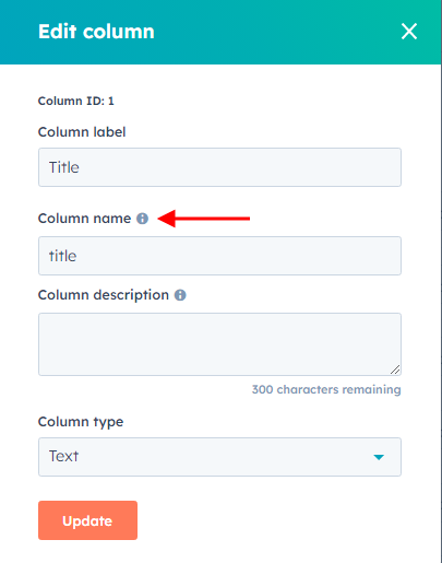
Note: All Column fields must be direct matches to a column name in your HubDB for it to be able to pull in the data. The column name can be found in your HubDB by hovering over a column heading, clicking the dropdown arrow, and clicking Edit. The column name is listed in the 'Column Name' field in the dialog box that appears.
- Manual [Boolean] : Check to manually add resource items.
- Resources [Repeater Group] : If Manual is checked, add as many resource items as needed.
- Image [Image] : Add image and alt text to use as thumbnail for the listing item.
- Title [Text] : Title for the listing item.
- Summary [RichText] : Summary for the listing item.
- Link [URL] : Link for the listing item.
- Date [Date] : Publish date for the listing item.
- Categories [Repeater Group] : Filterable items for the listing item.
- Label [Text] : The backend name for the category; this must match a Filter Name listed in Filters & Search.
- Option [Repeater Text] : The category options to add to the listing item. Options must match options pulled in from Filters & Search (a blog tag or author, a HubDB option, or a custom option).
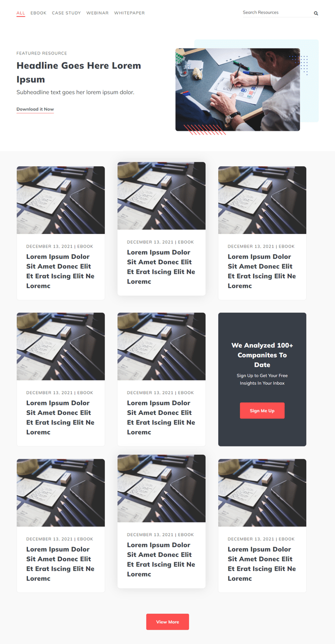
Include Featured Resources [Boolean]
Add a featured resource above the filterable listing.
Featured Resource [Group]
If Include Featured Resource is checked, add resource details.
- Image [Image] : Add image and alt text.
- Text [RichText] : Add text.
- Add CTA [Boolean] : Check to include a call to action button.
- CTA [Group Repeater] : If Add CTA is checked, add up to two call to action buttons.
- CTA Color [Choice] : Choose any of the following styles for the call to action - Primary, Secondary,Tertiary, Link, Link Dark Mode.
- CTA Text [Text] : Text to display in the button
- CTA Link [URL] : Link to apply to the button.
Include CTA [Boolean]
Check to add a call to action callout box in the listing.
CTA [Group]
Edit the contents of the callout box.
- Text [RichText] : Edit the text of the callout box.
- Add CTA Buttons [Boolean] : Check to add call to actions to callout box.
- CTA [Group Repeater] : If Add CTA Buttons is checked, add up to two call to action buttons.
- CTA Color [Choice] : Choose any of the following styles for the call to action - Primary, Secondary,Tertiary, Link, Link Dark Mode.
- CTA Text [Text] : Text to display in the button.
- CTA Link [URL] : Link to apply to the button.
- Form [Group] : Add a from to the callout box.
- Label Position [Choice] : Position field labels relative to their field inputs. Choose from Left, Top, or Inset.
- Button Position [Choice] : Align the submit button to the Left, Center, Right, or Full Width of the box.
- Form [Form] : Choose a form to use.
Enable Filters and Search [Boolean]
Check to show the filters and search bar above the listing.
Filters & Search [Group]
Edit the filters and search bar.
- Show Search [Boolean] : Check to show search in the filters & search bar.
- Use Dropdowns for Filters [Boolean] : Check to use dropdowns for the filters. This is recommended if more than one filter is added or a single filter has more than a few options.
- Filters [Repeater Group] : Add any number of filters.
- Filter Type [Choice] : Choose to create a Blog Authors, Blog Tags, HubDB, or Custom filter.
- Filter Label [Text] : The filter name displayed on dropdown filters.
- Filter Name [Text] : The backend name used to correlate the filter to categories on resource items (category names must match the filter name to be filtered).
- Custom Options [Repeat Text] : If Filter Type is set to Custom, set the available options in the filter. Options set in resource item categories must match these options.
- Author Picklist [Text] : If Filter Type is set to Blog Authors. Use a comma separated list of authors to show in the filter. It must use the full display name of the author.
ex: Author Name. - Tag Picklist [Repeater Tag Selector] : If Filter Type is set to Blog Tags, select blog tags to filter by.
- HubDB Table [HubDB Selector] : If Filter Type is set to HubDB, select a HubDB Table to pull a column from.
- HubDB Column [Text] : If Filter Type is set to HubDB, this is the name of a select or multi-select column you want to pull filter options from.
- Limit [Number] : Limit the number of filter options shown.
Layout [Group]
Fields to edit how the listing is displayed.
- Rows Per Page [Number] : Set the number of rows to show per page.
- Items Per Row [Number] : Set the number of items to show per row.
- Posts [Group] : Edit what content is display in each resource item.
- Show Tags [Boolean]
- Show Date [Boolean]
- Show Title [Boolean]
- Show Summary [Boolean]
- Show Read More Link [Boolean]
Text Strings [Group]
Miscellaneous text used throughout the module.
- Date Format [Text] : Change how the date in resource items is formatted. See the HubSpot Documentation for a list of formatting parameters.
- View More Text [Text] : Change the text displayed in the button that on click shows more resource items.
- Search Placeholder [Text] : Change the text displayed in the search bar before a user entered any text.
- Error Message [RichText] : Message to show if there are not any items that match the selected filters and searched text.
Styles
Colors
Edit the colors used throughout the module.
- Filters Section Dark Mode [Boolean] : Check if the filters/search bar appears against a dark background.
- Filters Section Background Color [Color] : Change the background color of the filters/search bar.
- Listing Section Dark Mode [Boolean] : Check if the resource listing appears against a dark background.
- Listing Background Color [Color] : Change the background color of the resource listing.
- CTA Dark Mode [Boolean] : Check if the in-listing call to action box has a dark background.
- CTA Background Color [Color] : Change the background color of the in-listing call to action box.
Module Spacing
Add margin and padding to the module.
Module spacing on mobile devices
Change margin and padding of the module on mobile