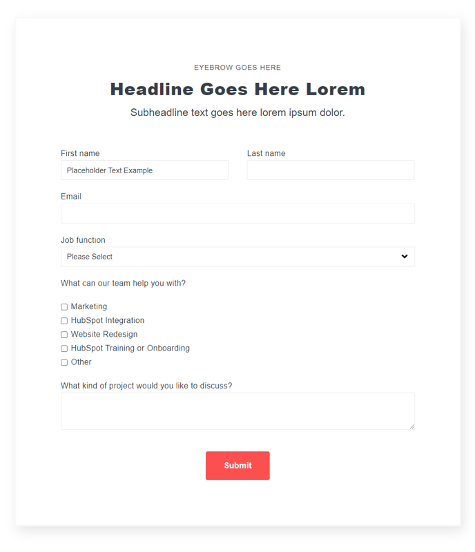
Theme Form
A form module with extra options not available in HubSpot's default module.
View a live demo of this module.
Content
- Include a heading
- Change heading alignment
- Choose to box in the form
- Choose label position (left, top, inset)
- Choose button position (left, center, right, full width, single field)
Styles
- Set Dark Mode
- Remove box shadow
- Change background color
- Change border styling (width, radius, color)
- Edit padding
Note: Edit the following global styles from your Theme Settings under the Forms section.
- Customize fonts for title, field labels, input text, help text, placeholder, and error text
- Change the field height
- Edit field and error background colors
- Edit field borders
- Edit boxed-in styling include background, border, and box shadow
- Edit dark mode colors
