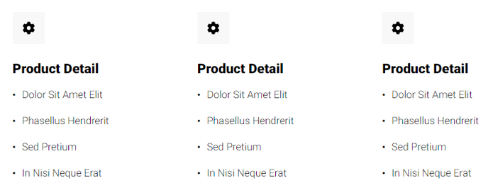
Feature Items
A set of items, such as benefits, services, etc., that can include an icon, text, and/or button.
View a live demo of this module.
Content
- Include a heading with eyebrow, heading, sub-heading, and/or text
- Add as many items as needed with icon (FontAwesome or custom image), title, text, and/or button
- Chang number of columns per row
- Change spacing between rows and columns
- Change heading placement (above items, left of items, right of items)
- Change icon placement (above text, right of text, left of text, inline with title)
Styles
- Set Dark Mode
- Change text alignment of heading
- Set a max width on the heading
- Change text align of feature items
- Style border, border radius, background color, and spacing of feature items
- Change height and color (only applicable to FontAwesome icons) of icons
- Enclose icons in a colored box (style height, width, radius, border, and background color of enclosing box)
- Change styling of lists
- Change space between list items
- Change bullet type
- Change bullet color (not applicable to image bullets)
- Enclose bullet (if using icon or image can enclose it in a colored box)
