Note: The section this module is added to should have its Content Alignment set to Full width.
View a live demo of this module.
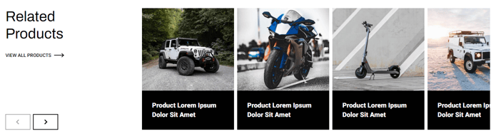
Content
- Include a heading with eyebrow, heading, sub-heading, text, and/or buttons
- Add a filter
- Add any number of products that include a category (if adding a filter), image, heading, text, and/or button
- Change spacing between slides
- Change number of sliders to show at a time on desktop, laptop, tablet, and mobile
- Change heading placement (remove, left of slider, right of slider, above slider)
- Edit filter label and placeholder
- Include aria labels on slider arrows for screen reader accessibility
Styles
- Set Dark Mode of heading/slider and slides separately
- Change text alignment of heading
- Change text alignment of heading on mobile
- Set a max width on the heading
- Change background color of slides
- Truncate the title to limit it to a certain number of characters before hovering, allowing for a more consistent look across cards with varying title lengths
- Set a minimum height on the title for a more consistent look across cards with varying title lengths
- Truncate description to limit the description to a certain number of characters so it doesn't overflow the card
- Change aspect ratio of images
- Set object fit of images (cover crops the image to fit the aspect ratio, contain resizes the image to fit inside the aspect ratio)
- Add a load in animation to the slides (fade in, up, right, down, or left)