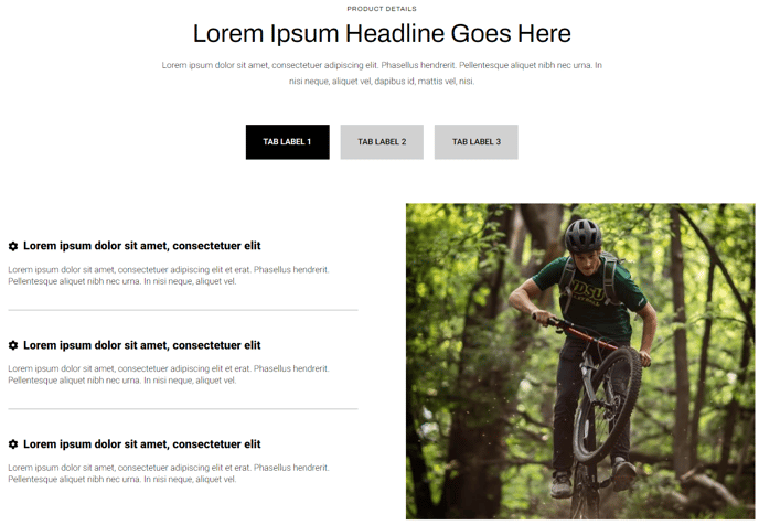
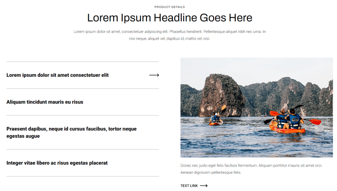
Tabbed Content
Tabular content that can contain rows and columns of text, image, video, form, or an icon list.
View a live demo of this module.
Content
- Include a heading with eyebrow, heading, sub-heading, and/or text
- Choose orientation of the tab navigation (vertical or horizontal)
- Set tab label
- Add however many rows is needed
- Set vertical alignment of columns in the row (top, middle, bottom)
- Set a max width on the row
- Add however many columns are needed and set their width (Note: The combined percentage of all column widths in the row must not exceed 100%)
- Choose column type (text, icon list, image, video, or form)
- In a text column, include eyebrow, heading, sub-heading, text, and buttons
- In an icon list column, add however many list items is needed with optional icon (FontAwesome or custom), title, and text
- In a video column, include a preview thumbnail, video, and description
- In a form column, include a heading (eyebrow, heading, sub-heading, text) and form
Styles
- Set Dark Mode
- Change heading text alignment
- Set a max width on the heading
- For icon list columns, change the icon height and color (color is only applicable to FontAwesome icons)
- For forms:
- Set Dark Mode
- Change heading text alignment
- Box in the forms (edit background, border, box-shadow, and padding)
- Change label position (left, top, inset)
- Change button position (left, center, right, full width, single field)
- Change button color

