View a live demo of this section here.
The following is a detailed listing of the styling edits made to the section, the modules used in the section, and field changes from the modules' default state.
Section Styles
| Padding | Top: 0 |
Modules
| Section Options | Overlap |
| Overlap > Section | Above |
| Card Style | Slider |
| Layout > Text Tags Position | Bottom |
| Layout > Date Position | Left of Tags |
| Layout > Desktop | Thumbnail Position: Left Image Spacing: theme.global.spacing.columns.desktop Spacing: 0 Per Page: 1 Per Move: 1 Show Pagination: false |
| Layout > Tablet | Thumbnail Position: Left Image Spacing: theme.global.spacing.columns.desktop Spacing: 0 Per Page: 1 Per Move: 1 Show Arrows: false Show Pagination: true |
| Layout > Mobile | Thumbnail Position: Top Image Spacing: theme.global.spacing.columns.mobile Spacing: 0 Per Page: 1 Per Move: 1 Show Arrows: false Show Pagination: true |
| Styles > Mobile > Background | Background Color: theme.global.colors.backgrounds.base.color |
| Styles > Module > Borders | Radius: theme.global.borders.radius |
| Styles > Module > Spacing > Desktop > Padding | Top: theme.global.spacing.columns.desktop Right: theme.global.spacing.columns.desktop * 2 Bottom: theme.global.spacing.columns.desktop Left: theme.global.spacing.columns.desktop * 2 |
| Styles > Module > Spacing > Tablet > Padding | Top: theme.global.spacing.columns.desktop Right: theme.global.spacing.columns.desktop Bottom: theme.global.spacing.columns.desktop Left: theme.global.spacing.columns.desktop |
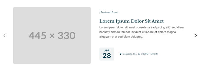
| Styles > Thumbnail > Width | 445 |
| Styles > Thumbnail > Aspect Ratio | Unset |
| Styles > Thumbnail > Borders | Radius: theme.global.borders.radius |
| Styles > Title > Font | theme.typography.heading_three.font |
| Styles > Title > Mobile Font Size | theme.typography.heading_three.mobile_font_size |
| Styles > Text Tags > Margin | Top: theme.global.spacing.rows * 2 |
| Styles > Card > Borders | Border Style: {Top: {Style: None}} |
| Styles > Card > Box Shadow | Animate: None |