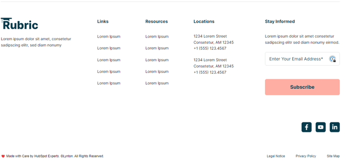
Footer - Informational
Large footer with logo, tagline, two-column link list, contact information, subscription form, socials, copyright text, and legal links.

View a live demo of this partial here.
The following is a detailed listing of the styling edits made to the partial's sections, the modules used in the sections, and field changes from the modules' default state.
Section 1
Section Styles
| Alignment and spacing > Padding | Top: 50 Bottom: 50 |
Modules
Divider Line
No changes to default state.
Section 2
Section Styles
No styles have been applied.
Modules
| Custom Columns |
{ |
| Content Type | Company Logo |
| Styles > Module > Alignment | Mobile: Center |
| Visible Elements | Body Text |
| Text Size | Small |
| Styles > Module > Max Width > Alignment | Mobile: Center |
| Styles > Module > Spacing > Desktop > Margin | Top: theme.global.spacing.rows |
| Styles > Text Alignment | Mobile: Center |
Navigation
| Nav Type | Static |
| Menu Type | Simple |
| Columns | Desktop: 2 Tablet: 1 Mobile: 2 |
| Styles > Module > Alignment | Desktop: Right Mobile: Center |
| Styles > Main Links > Text > Alignment | Mobile: Center |
| Styles > Main Links > Spacing between links | 80 |
| Styles > Main Links > Spacing between rows | 25 |
| Styles > Child Links > Text > Alignment | Mobile: Center |
| Styles > Child Links > Text > Font | Size: theme.typography.body_text_small.font.size |
| Visible Elements | Heading, Body Text |
| Semantic Heading Level | 6 |
| Style Heading Level | 6 |
| Text Size | Small |
| Styles > Text Alignment | Mobile: Center |
| Visible Elements | Heading, Body Text |
| Semantic Heading Level | 6 |
| Style Heading Level | 6 |
| Text Size | Small |
| Styles > Module > Alignment | Mobile: Center |
| Styles > Text Alignment | Mobile: Center |
| Media Type | Form |
| Form Layout > Button Position | Full |
| Styles > Module > Alignment | Mobile: Center |
| Styles > Module > Spacing > Desktop > Margin | Top: theme.global.spacing.rows |
Section 3
Section Styles
| Alignment and spacing > Vertical alignment | Middle |
| Alignment and spacing > Padding | Top: 100 Bottom: 30 |
Modules
| Styles > Text Alignment | Desktop: Right Mobile: Center |
Section 4
Section Styles
| Alignment and spacing > Padding | Bottom: 30 |
Modules
| Visible Elements | Body Text |
| Text Size | Tiny |
| Styles > Module > Alignment | Mobile: Center |
| Styles > Text Alignment | Mobile: Center |
| Utility Items | Utility Type: Link List |
| Styles > Module > Alignment | Desktop: Right Tablet: Center |