View a live demo of this section here.
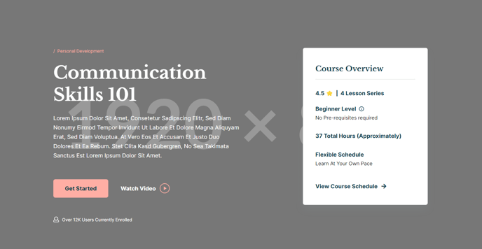
The following is a detailed listing of the styling edits made to the section, the modules used in the section, and field changes from the modules' default state.
Section Styles
| Alignment and spacing > Padding | Top: 160 Bottom: 85 |
Modules
| Semantic Heading Level | 1 |
| Style Heading Level | 1 |
| Styles > Dark Mode | true |
| Utility Items > Utility Type | Button |
| Styles > Module > Spacing > Desktop > Padding | Top: 60 Bottom: 60 |
| Layout > Icon Position | Left |
| Layout > Desktop | Columns: 1 Justify: Start |
| Layout > Tablet | Columns: 1 Justify: Start |
| Layout > Mobile | Columns: 1 Justify: Start |
| Styles > Dark Mode | true |
| Styles > Alignment | Desktop: Left |
| Styles > Module > Max Width | 400 |
| Styles > Module > Alignment | Desktop: Right Tablet: Center |