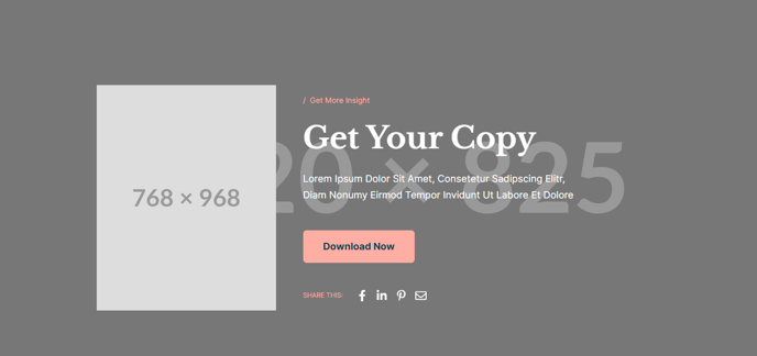
Hero - Resource
A hero section with an image, social share, and a call to action button.

View a live demo of this section here.
The following is a detailed listing of the styling edits made to the section, the modules used in the section, and field changes from the modules' default state.
Section Styles
| Alignment and spacing > Max Width | theme.global.max_width_narrow |
| Alignment and spacing > Padding | Top: 160 Bottom: 85 |
| Alignment and spacing > Vertical alignment | Middle |
Modules
| Media Type | Image |
| Styles > Module > Animation | Fade Up |
| Visible Elements | Eyebrow, Heading, Body Text |
| Semantic Heading Level | 1 |
| Style Heading Level | 1 |
| Styles > Dark Mode | true |
| Styles > Module > Max Width | 520 |
| Utility Items | Utility Type: Button |
| Styles > Module > Spacing > Desktop > Padding | Top: theme.global.spacing.rows * 2 Bottom: theme.global.spacing.rows * 2 |
| Social Type | Share |
| Styles > Dark Mode | true |
| Styles > Icons > Enclose | false |