Hidden Modules
The following section is the hero used across all blog listing pages.
Section 1
Showcase your most recent posts.
The following sections are used in the Main Listing of the template, seen on the main URL of the blog.
Section 1
A slider listing a set of posts using a particular tag.
Repeats three times in the listing to showcase three topics.
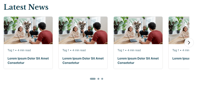
Section 2
Simple decoration to visually divide each topic listing.
Repeats between each topic listing.
Section Styles
| Alignment and spacing > Content alignment | Full Width |
| Alignment and spacing > Padding | Top: 0, Bottom: 0 |
Modules
Divider Line
No changes from default state.
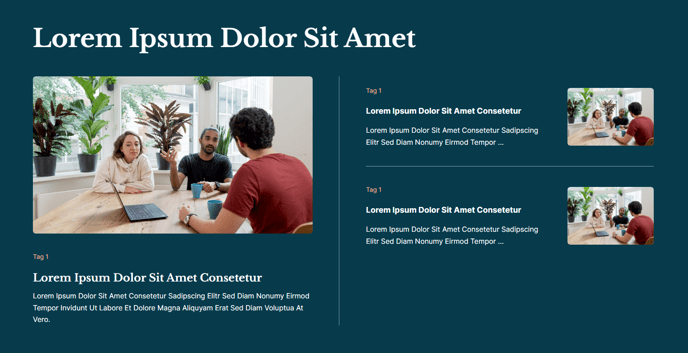
The following sections are used in the Tag Listing and Author Listing of the template, seen on /tag or /author URLs. View a demo of the Tag Listing here and view a demo of the Author Listing here.
Section 1
Simple heading with a callout box specifying the tag/author being listed
and providing a link back to the main listing.

Section 2
A listing of posts with infinite load.
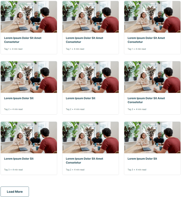
The following sections are used in the Simple Listing of the template, seen all the /all page. View a demo of the Simple Listing here.
Section 1
Simple heading.
 Section Styles
| Alignment and spacing > Content alignment | Full Width |
Modules
| Visible Elements | Heading |
Section 2
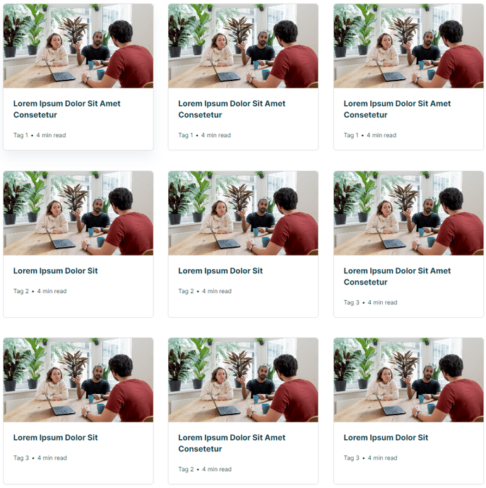
Listing of all blog posts.
Section Styles
| Alignment and spacing > Content alignment | Full Width |
| Alignment and spacing > Padding | Top: 0 |
Modules
| Card Style | Grid |
| Data Source | Blog |
| Blog Posts > Post Type | Listing |
| Blog Posts > Navigation Type | None |
| Blog Posts > Include | Tags, Read Time, Thumbnail |
| Layout > Desktop | Columns: 3 |
| Layout > Tablet | Columns: 3 |
| Layout > Mobile | Columns: 1 |
| Styles > Text Tags > Divider | Bullet |
The following sections are used in the Sidebar area of the template.
Section 1
Section Styles
| Alignment and spacing > Content alignment | Full Width |
Modules
| Utility Items | Utility Type: Site Search Content Types: Blog Posts |
| Styles > Search > Search Type | Box |
| Visible Elements | Heading |
| Semantic Heading Level | 3 |
| Style Heading Level | 4 |
| Styles > Module > Spacing > Desktop > Padding | Top: 40 Bottom: 20 |
| Custom Tags > Dynamic Data | true |
| Custom Tags > Data Type | Blog Tags |
| Visible Elements | Heading |
| Semantic Heading Level | 3 |
| Style Heading Level | 4 |
| Styles > Module > Spacing > Desktop > Padding | Top: 80 Bottom: 20 |
| Card Style | List |
| Layout > Add Divider | False |
| Layout > Desktop | Thumbnail Position: Left Spacing Between Rows: 20 Spacing Between Image and Text: 20
|
| Layout > Tablet | Thumbnail Position: Top Spacing Between Rows: 20 Spacing Between Image and Text: 20
|
| Layout > Mobile | Thumbnail Position: Left Spacing Between Rows: 20 Spacing Between Image and Text: 20
|
| Styles > Card > Box Shadow | Animate: None |
| Styles > Thumbnail > Aspect Ratio | 1:1 |
| Styles > Thumbnail > Width | 90 |
| Styles > Title > Font | Size: theme.typography.body_text_medium.font.size |
| Styles > Title > Mobile Font Size |
theme.typography.body_text_medium.font.size
|
| Visible Elements | Heading |
| Semantic Heading Level | 3 |
| Style Heading Level | 3 |
| Layout > Desktop > Button Position | Bottom |
| Styles > Module > Spacing > Desktop > Margin | Top: 80 |
| Styles > Module > Spacing > Desktop > Padding | Top: 80 Bottom: 80 |
| Styles > Text Alignment | Desktop: Center |
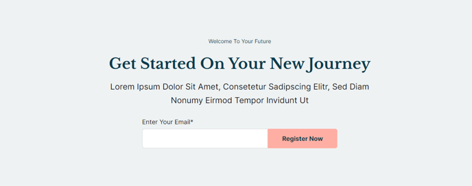
The following sections are used in the Callout area of the template.
Section 1
Callout to a subscription form.