Example 1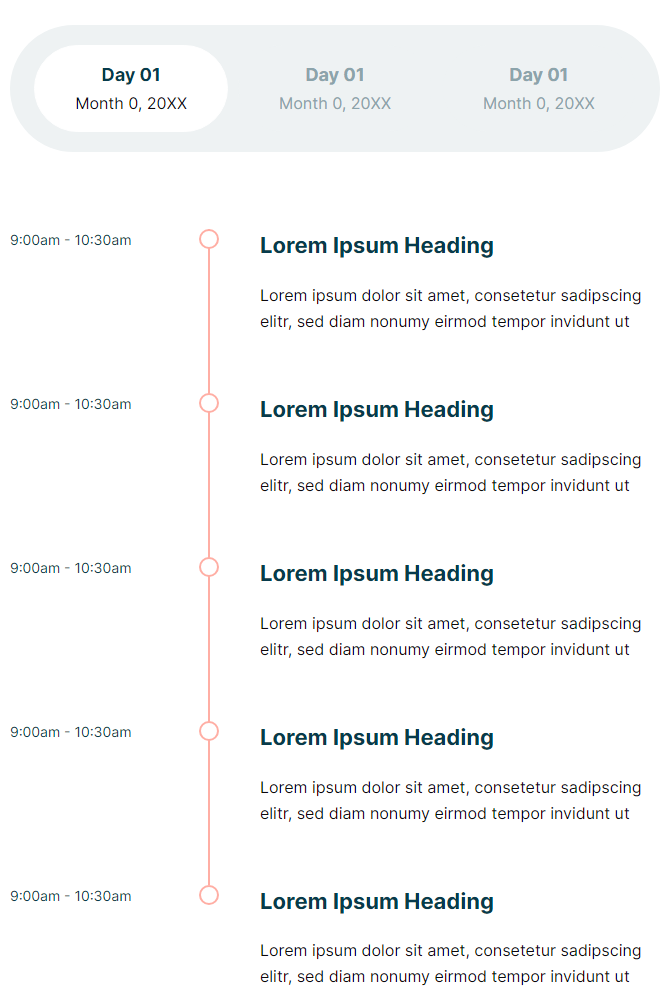
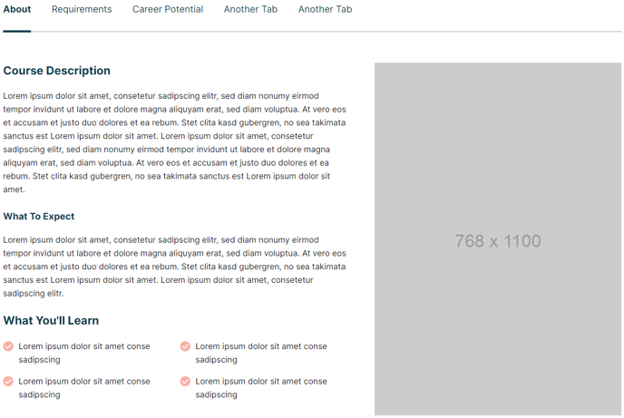
Example 2
View a live demo of this module.
The following is a detailed listing of all the Content and Style fields available in this module.
Content
- Tabs [Repeater Group]
- Title [Text]
- Description [Text]
- Columns [Repeater Group]
- Label [Text]
This field is just used as a label in the module editor repeater list. - Width [Number]
Columns align on a 12 column grid, so the sum of all columns should be no more than 12. - Rows [Repeater Group]
- Label [Text]
This field is just used as a label in the module editor repeater list. - Content Type [Choice]
Choices: Text, Button, Image, Form, Video, Agenda - Text [Common Module Fields]
If Content Type is Text. - Buttons [Repeater Group]
If Content Type is Button.- Buttons [Common Module Fields]
- Image [Image]
If Content Type is Image. - Image Link [Link]
If Content Type is Image. - Form [Common Module Fields]
If Content Type is Form. - Video [Common Module Fields]
If Content Type is Video. - Events [Repeater Group]
If Content Type is Agenda.- Text [Common Module Fields]
- Label [Text]
- Label [Text]
- Advanced [Common Module Fields]
Styles
- Dark Mode [Boolean]
Check to use Dark Mode colors set in the Theme Settings. - Module [Group]
- Module Styles [Common Module Fields]
- Tabs [Group]
- Styles [Choice]
Choices: Link, Button - Space between tabs [Number]
- Links [Group]
- Main Text [Group]
- Font Styles [Common Module Fields]
- Description Text [Group]
- Font Styles [Common Module Fields]
- Box Styles [Common Module Fields]
- Main Text [Group]
- Arrows [Group]
When there are too many tabs to fit the width of the module the navigation will become a slider.- Type [Choice]
Choices: Arrow, Chevron - Size [Number]
- Size (Mobile) [Number]
- Color [Color]
- Color (Hover) [Color]
- Box Styles [Common Module Fields]
- Type [Choice]
- Box Styles [Common Module Fields]
- Styles [Choice]
- Timeline [Group]
- Line [Group]
- Width [Number]
- Color [Color]
- Connector [Group]
- Size [Number]
- Offset [Number]
Used to move the connectors up (negative offset) or down (positive offset). - Box Styles [Common Module Fields]
- Text Styles [Common Module Fields]
- Line [Group]
- Text [Group]
- Text Styles [Common Module Fields]
- Images [Group]
- Image Styles [Common Module Fields]
- Forms [Group]
- Form Styles [Common Module Fields]
- Videos [Group]
- Video Styles [Common Module Fields]